Utah’s new flag unfurled despite a ‘Heads, we win. Tails, you lose.’ petition

Utah's new state flag waves in the breeze next to the U.S. flag and a flag for Real Salt Lake at America First Field in Sandy, Utah, on Wednesday, June 7, 2023.

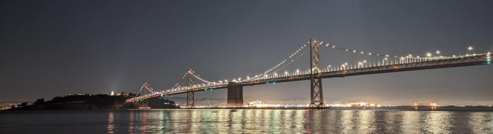
Utah’s new state flag waves in the breeze next to the U.S. flag and a flag for Real Salt Lake at America First Field in Sandy, Utah, on Wednesday, June 7, 2023.

Utah’s flag officially got an upgrade this month and I couldn’t be happier. The new banner features a large, golden beehive in a blue hexagon over three horizontal stripes representing the state’s red rocks, white mountains and blue skies. It succeeds the old design, which was primarily the state’s seal on a blue background — an approach emulated by about 23 other states. More on that later.

The new design had to survive a challenge from a relatively small group of unhappy residents displeased that the old design was being demoted (but not eliminated). Despite the group’s claims of erasure, the old flag remains the state’s historic flag and people can fly whichever flag they choose. Additionally, the state seal that the old flag is based on remains as-is.

The residents against the new flag twice attempted to gather enough signatures to force a vote, but fell considerably short of their goal both times. While I appreciate their democratic efforts, I felt the proposal would undo a compromise to keep both flags in favor of solely the older design. Hence why I called the proposal from Restore Utah’s Flag as “Heads, we win. Tails, you lose.”

The old flag would have survived as a state symbol no matter what, so they didn’t really have anything to lose:

  • Had the measure succeeded, the old flag would’ve been the sole flag.
  • Had the measure failed, the old flag remains an official flag in addition to the new design.

Truly a win-win for supporters of the old flag. Not so much for everyone else.

Had the proposal passed, the state would’ve lost out on what is arguably a better way to represent the state (in flag form).

With that said, the new flag probably wouldn’t have entirely gone away had the Restore Utah’s Flag effort succeeded and voters had excised the new banner as an official state symbol. Even before the new banner officially became the state flag this month, the design was becoming widely adopted. I’m fairly sure that the design would’ve thrived even without the state’s imprimatur.

My homage to the new Utah state flag depicts a curling stone as a beehive in a blue hexagon. It's part of a variation of the new logo of the Oval Curling Club.

My homage to the new Utah state flag depicts a curling stone as a beehive in a blue hexagon. It’s part of a variation of the new logo of the Oval Curling Club.

After the Utah Legislature approved the new design last year, I began thinking about ways to incorporate the banner in the team attire of the Oval Curling Club. Many sports uniforms feature the flag of the state or province they hail from (think of Baltimore Ravens and their embrace of the Maryland state flag in their logos).

My curling club is undergoing a rebranding and I took the opportunity to design a logo that incorporated the new Utah flag. I also designed a variation that depicted a curling stone as a beehive in the blue hexagon. I’ll be forthright here and note that the club’s members seem to prefer the original beehive version over the curling stone beehive.

I was honored when the club members voted for the designs to be the new logos for the club (more on that in a future blog post).

I wouldn’t have jumped at the opportunity to incorporate the old flag into the club’s logo or uniforms. At most, it could’ve been used as a shoulder patch.

Challenging the new standard

Over the past year or so, it’s been interesting to see the arguments about why the new flag was a harbinger of the end of civilization and the only way to stave off this chaos was to have the old flag be the only official state flag. Every few days, I would search Twitter for “Utah flag” to keep up on the hyperbole.

Defenders of the old flag touted the difficulty in adjusting the design for other purposes as a feature, not a defect. They lamented that people jumped on the opportunity to remix the new flag design for fun or to make a point.

It has been popular since the new design was introduced last year to replace the beehive with another symbol, like a popular whale sculpture on display in a Salt Lake City roundabout. Others changed the flag colors to represent LGBTQ+ identities, which generated ire (although it must be pointed out that people could also put the old flag over a rainbow background or the like, but most never really bothered to before).

Expressing outrage at the possibility of a symbol being embraced and remixed by non-traditional groups was one of the tactics frequently deployed by proponents of the old flag. Other posts on social media asserted that the new flag (approved by the heavily Republican Legislature) was somehow Marxist or an attempt to erase history — which doesn’t make sense when the old flag still has official status.

Another argument was against the $500,000 cost for the new flag proposal (which has already been spent, to the best of my knowledge). It was primarily for outreach efforts — most of the flag replacement costs weren’t included in this figure because groups would simply get a banner with the new design when their old flags needed to be swapped out due to wear and tear.

A half million is a hefty sum for you or me, but it’s 0.0017% of the state’s $29.4 billion annual budget or about 14 cents per Utahn.

Speaking of costs, many heritage flag opponents ignored or justified the cost of running the petition for a public vote. Setting aside all the money and effort that the signature gathered expended, county agencies needed to spend money to verify petitions (which admittedly is part of their jobs).

Had a special election been called as it would’ve been under the original effort, the cost of that would’ve been in the millions (which is more than a half million). Spending millions to fight a half-million dollar expenditure seems like the textbook definition of cutting off one’s nose to spite one’s face.

Ultimately, I don’t have any reason to doubt the sincerity of the heritage flag proponents, but many of the arguments put forward seemed breathlessly disingenuous.

At the same time, some of the critiques of the new flag’s design seemed valid — appreciating design can be largely subjective despite efforts by flag enthusiasts to apply some objective guidelines (which some then try to apply far too rigidly). It’s kind of funny when some call the new flag as being overly corporate — many big corporations are deemphasizing logos in favor of quirky wordmarks.

Even if the new flag isn’t perfect, it certainly seems like an improvement.

The ol’ SOB (seal on a bedsheet)

Find the Utah flag among the state flags displayed in the warm room of the former Southern California Curling Center in Vernon, Calif., on Thursday, Jan. 20, 2022.

Find the Utah flag among the state flags displayed in the warm room of the former Southern California Curling Center in Vernon, Calif., on Thursday, Jan. 20, 2022.

Prior to the current flag fervor, I didn’t give too much thought to Utah’s flag. It was always a bit ho-hum and I never owned a copy of it. I did buy one once — as part of a fundraiser for the now-defunct Southern California Curling Center in Vernon, California.

The curling center had asked people to buy a flag to represent their state, nation or province in the new facility. I hesitated making the purchase — I didn’t particularly care for the flag, but I ultimately contributed because I wanted to ensure that Utah was represented at the unique sport facility just south of downtown Los Angeles. I was also supposed to get a curling center nametag with my name and the flag, but the facility closed before that came to pass.

At the time I was making the donation in 2021, there was buzz about changing Utah’s flag. There was a flag to commemorate the 125th anniversary of Utah’s statehood, but I was ambivalent about that design too — the banner was divided into red, white and blue quadrants that resembled an “X” underneath a circle featuring the beehive. It just didn’t work for me.

In any case, I donated for the old Utah flag and I told myself I would be happy to buy a new flag to replace it whenever that came to pass.

When I finally made my way to Southern California to visit the curling center in January 2022, I tried to spot Utah’s flag on the giant wall with all the flags. It took me quite a while to locate it, even after I figured out that the state flags were displayed alphabetically.

My inability to find Utah’s flag in the pack of U.S. flags underscored one of the biggest complaints of the historic flag — as a symbol that should clearly identify the state it represents, the Utah seal on a blue background didn’t do a very good job.

There’s so much meaning in the old flag – like HATU and 6981!

The central part of Utah's historic flag is shown backwards.

The central part of Utah’s historic flag is shown backwards.

Defenders of the historic flag often like to point out all of the symbolism in the design, such as a bald eagle, American flags, bees about the beehive and sego lily flowers (which apparently helped stave off hunger during the state’s pioneer era).

All of these symbols are well and good (and survive on the state seal), but it’s extremely hard to appreciate the symbology when you’re looking at a flag a hundred feet away. At such a distance, it’s easy to miss details — such as a mistake on the placement of the year Mormon settlers first arrived.

That error wasn’t officially fixed until 2011, or 89 years after the goof was first committed (basically the year 1847 was supposed to be on the shield, but the original text of the law was easy to misinterpret and the year was placed below the shield to appear as if it were behind it).

Also, writing on a flag is generally considered to be a bad idea (although there are always exceptions to this guidance, like California’s flag). Utah’s historic flag is an excellent example of this, as it will be seen as backwards about 50% of the time when it’s on a flagpole.

As much as one might draw meaning from the words “Utah” and “Industry” and the years 1847 and 1896, what meaning can be gleaned from “Hatu” or “Yrtsudni”?

Some historic flag defenders will point out that it doesn’t matter that people can’t pick out Utah’s blue flag among dozens of other blue flags — in Utah, it will likely be the only blue flag flying. I suppose that consideration may also apply to all the symbolism on the flag — it doesn’t matter if few people can see it well enough to appreciate the intricate details, it’s enough to just know it’s there.

At the same time, is it fair to ask the general public to automatically know, understand and appreciate all the old flag’s intricate symbols when they’re difficult to make out at a distance?

Demanding a flag plebiscite when it had never been done before

Wrapping things up, I found it fascinating to see some demand a public vote on the new flag. I wasn’t necessarily opposed to the idea (despite the format heavily favoring the heritage flag), but insisting that the vote was absolutely necessary for a state symbol seemed to be a bit too much.

Some heritage flag supporters asserted that a public vote had been promised, but that isn’t my recollection of the process.

The state flag has been changed repeatedly over 121 years. (Utah didn’t really have a state flag for the first quarter-century of statehood, and early flags were typically one-offs until around 1921, according to a very thorough Deseret News article on the history of the state flag.)

There was never a public vote on any of the changes.

Also, Utah has 28 or so official state symbols. To the best of my knowledge, there has never been a plebiscite on any of them. As a curler, I demand a recount on making skiing and snowboarding the official state winter sports.

Many of the state’s symbols were adopted by the Legislature when school groups appealed to them to make the change (often as part of a lesson on how laws are passed at the state level).

In that regard, the new state flag has also provided a civics lesson — even if some people weren’t exactly civil about it. Having two state flags that residents can choose to fly was probably the best outcome of this process.

Both will be likely used more often than many of Utah’s other symbols, including the official state tartan.

New Muni map offers cleaner design, but misses key info

A side-by-side look of the the old and new Muni maps.

A side-by-side look of the the old and new Muni maps.

The San Francisco Municipal Transit Authority launched a Muni service increase over the weekend. Called Muni Forward, the changes included a new map that offers a cleaner, more readable perspective of the bus, light-rail, streetcar and cable car routes, but I’m wasn’t happy. Most of the following post is adapted from a comment I left on the SFMTA site.

I suppose it’s nice that it’s a cleaner presentation, but there are so many things missing from this new map compared to the last version. As someone who is only a frequent visitor, I appreciated being able to orient myself with the Muni map by comparing routes with landmarks that I’m either near or where I would like to go. Most of that is gone with the new map.

To give a recent example, I wanted to visit the first weekend of the Cherry Blossom Festival in Japantown. I knew the general location and the route, but I was much more comfortable telling my traveling companion where we were going when I could point it out on the transit map at the nearest shelter.

A side-by-side comparison of how Japantown is depicted in the old and new Muni maps.

A side-by-side comparison of how Japantown is depicted in the old and new Muni maps.

I couldn’t do that with the new map. There’s no neighborhood labels, even for the more commonly known ones (including Chinatown). If I wanted to know where Haight-Ashbury, North Beach, Castro and Mission were located, I couldn’t easily know for sure with the new map. While major streets are identified, the names of many smaller streets are omitted.

If I wanted to go to a specific place in the Presidio, like Fort Point, Crissy Field or the Walt Disney Family Museum, I could easily find those locations before whereas this new map of the Presidio is a relatively blank, green canvas. The new map is even missing the Palace of Fine Arts, which is one of the most-common sights in the city.

A side-by-side comparison of how the Presidio is depicted in the old and new Muni maps.

A side-by-side comparison of how the Presidio is depicted in the old and new Muni maps.

The map does have some advantages. Even looking at my examples, the map is easier to read and discern information about transit routes. It’s easier to follow some routes and determine when some limited-stop Rapid routes don’t stop for boardings and alightings.

Perhaps the map doesn’t need to provide as much information as it used to. After all, we’re in a world of smartphones, where most knowledge is available near instantaneously. Even before that, there were tourist guides and maps in multiple languages to guide people through this city.

However, cellphone batteries die and people don’t always have tourist guides on hand. Tourist guides and maps also tend to focus on the most popular or common, whereas the old map featured playgrounds, museums, community centers, even pier numbers.

I don’t know what the priorities were for this new map, but it doesn’t seem as user-friendly as it could be for tourists, visitors to the city or residents traveling to new neighborhoods. It’s missing many of the landmarks and detail that give much of San Francisco its vibrant identity. The map is ultimately a disservice to many transit users and will force them to turn elsewhere for less-optimal solutions.

This slideshow requires JavaScript.

’Twas a month after Christmas, so here’s my holiday card

The latest version of my annual holiday cards.

The 2012 version of my annual holiday card. The caption says, “Although there’s no snow, you can make a snow angel in a hot town like Chico!”

Yes, this post is late, but then again my Christmas cards were delayed again this year. What were supposed to be Christmas cards quickly became holiday cards, meant to welcome the new year. If I had delayed them any further, they would’ve celebrated Dr. Martin Luther King Jr. Day.

In addition to the usual procrastination, I was stumped about the card’s concept. Since I’ve started making my own cards, I’ve tried to either include a humorous element, something about Chico or both. It took some last-minute inspiration for me to get this year’s cards out the door.

After teasing it a few years ago, I was all set to do the “Sierra Nevada Santa” — my take on the iconic Coca-Cola Santa ads, but with local brew Sierra Nevada instead of sugar water. There were some hurdles: I don’t own a Santa suit and I started getting cold feet about the concept.

While people don’t give a second thought to the Coke Santa concept (except perhaps to remark about soft drinks contributing to obesity), I started to see some potential pitfalls with the Sierra Nevada incarnation. Although it’s all in good fun, I wondering if people would question combining beer with an iconic childhood figure. And speaking of beer, what sort of image does it sent to have a man responsible for sleighing across the world in a 24-hour period to be indulging in an alcoholic beverage? Yes, the reindeer do the flying, but the jolly old man does all the driving, so drinking and sleighing seemed out of the question.

I thought about replacing the Celebration Ale with one of Sierra Nevada’s fine gourmet mustards, but the visual of Santa spreading mustard on a cold-cut sandwich didn’t seem to work.

Also, I don’t own a Santa suit and my line on one dried up. Buying a suit would have cost at least $30 and I had to again consider how much it’s worth to do a comedy bit, especially since I would need a fake Santa beard too.

So Sierra Nevada Santa was put on ice for another year, but the concept may show up again in some different form in upcoming years. I also had another idea to do a side-by-side comparison showing Santa and me, but that concept wasn’t fully baked.

Making a karaoke confetti snow angel on the stage of Feather Fall Casino Brewing Co. during the Karaoke Rockstaz show.  (Karaoke Rockstarz image from <a href="http://www.facebook.com/KRockstarz">facebook.com/KRockstarz</a>)

Making a karaoke confetti snow angel on the stage of Feather Fall Casino Brewing Co. during the Karaoke Rockstaz show. (Karaoke Rockstarz image from facebook.com/KRockstarz)

Christmas was fast approaching and I was still stumped. Thankfully, like most things in life, karaoke provided my salvation. I was at the Karaoke Rockstarz live-band karaoke show at Feather Falls Casino when I saw the show’s MC fire off an explosive canister of confetti.

Watching the colored debris waft gently the stage floor, I started thinking about making a snow angel with the confetti. During an intermission, I asked about how much the material cost and what a confetti snow angel look like. The MC was cooperative and we took a picture of me on the stage making the snow angel.

Unfortunately, I could see some problems — with the confetti all over the floor, the snow angel image couldn’t be easily seen. Laying on top of the confetti basically crushed it, but provided little context.

Sensing I was on the right track, I continued to develop the idea. Instead of paying a kingly sum for confetti, I thought I would make my own using colored construction paper and a paper shredder. However, buying construction paper would’ve cost about $30, so I looked for cheaper options.

A stop at the nearby Michael’s turned up some wrapping paper on sale for about $2.50 each. Sold.

There were different varieties, but all I needed were green and red. I supplemented those rolls with some old Ikea wrapping paper that I’ve held onto for years.

I ran home to shred up some confetti. I saved some time by cutting off large swathes of the wrapping paper, folding them lengthwise and feeding them into the shredder. In about 30 minutes, I had a big trash bag full of red, green and gold confetti. It was about half white colored because of the obverse side of the wrapping paper.

After that, I zoomed back to an area where there would be a relatively clean floor (to help make clean up a snap). For this phase, I had my friend Evan spread the confetti while I lay on the floor and waved my arms and legs in the customary snow angel pattern. Here’s sort of what it looked like:

After the initial snow angel was made, we took some photos to show the "making of." Given my relatively unflattering pose, I opted not to use it for the card.

After the initial snow angel was made, we took some photos to show the “making of.” Given my relatively unflattering pose, I opted not to use it for the card.

We tried to parody an early scene in PSY's "Gangnam Style" video, but the results were underwhelming and perhaps a little disturbing.

We tried to parody an early scene in PSY’s “Gangnam Style” video, but the results were underwhelming and perhaps a little disturbing.

We also thought it would be funny to take a photo of paper flying into my mouth, like that scene involving PSY in the music video “Gangnam Style.” Ultimately, the photo didn’t really turn out to be very flattering and it’s too hard to understand the context (it just looks like a bunch of colored paper on a fat guy’s face on the floor).

With the initial photos done, I needed to get the card ready for publication. At the same time, I was preparing to go to San Diego for the holidays.

It took a few days to get the cards ready to go. I tried to submit a design online, but I thought it would take too long to process. Thankfully, the people at the Carmel Mountain Ranch Costco were very accommodating on an in-store rush order. The design wasn’t exactly what I wanted, but I think they turned out OK.

The cards were finished by Dec. 23. Christmas passed and a little procrastination settled in. The priority of sending the cards out fell behind spending time with family and going through some old boxes. However, I was able to get the cards mailed out the weekend before the New Year. Upon returning to Chico, I distributed nearly all of my local cards by the end of the first week of January.

As always, sending out Christmas cards is an evolving process. I think I have some good ideas for 2013, so I will hopefully be able to get the cards out sooner.

In any case, here is the 2012 card for all to enjoy. Merry Christmas and happy New Year!

Behind the scenes of The Buzz’s new look

Today marks the launch of The Buzz with a fresh facelift. The new design is geared to offer a cleaner, more dynamic look at the area’s lively arts. While the look is streamlined, all of The Buzz’s regular features are there. We also have updated ways to browse upcoming movies and events.

Please take a look — either in print or with the samples below. As the designer who oversaw the process, I’m excited by the end result and I hope you will be as well.

The June 17 Buzz The June 24 Buzz cover
Old design (click to embiggen) New design (click to embiggen)

Opening pages up: Since we launched the old design years ago, we had changed how tall Buzz pages were and the design was starting to feel cramped. It was time for a flexible design that looked great.

Last December, I sat down on a Saturday and took the previous edition of The Buzz. Using a concept page that I have previously designed, I spent several hours redesigning the section. I moved elements around, updating fonts and styles and seeing how everything fit. After some tweaking and input from others, it became the blueprint for the new design and launched with the arrival of our new Buzz editor Jammie Salagubang.

Here are the music pages from the old and new designs. The new design opens up the entire width of the page for photos and articles (it was very difficult to have side-by-side articles in the old design). Some of the new pages explode with color.

Music page from the June 17 Buzz Music page from the June 24 Buzz
Old design (click to embiggen) New design (click to embiggen)


New elements:
In the old design, the calendar and movie capsules had interesting information for people looking for stuff to do on weekends, but the presentation was mostly a sea of grey text.

The new movies section features a “What’s Playing” guide. At a glance, readers can see all the movies playing at every theater. There are also ratings, review scores and more.

June 17 movie guide June 24 movie guide
Old design (click to embiggen) New design (click to embiggen)

The new calendar makes it easier to spot key events in the week ahead.
There’s a lot more color and interesting elements that will hopefully
encourage people to hold onto the guide for the entire week.

June 17 Calendar June 24 Calendar
Old design (click to embiggen) New design (click to embiggen)

Ultimately, I view the new design as an evolution of The Buzz. In the weeks to come, we’ll have some new ways to showcase local events in the area that I hope you’ll enjoy.

Feedback: Please let us know what you think by leaving a comment on this blog. I’m sure Jammie would also appreciate your feedback at buzz -at- chicoer dotcom.

Seasons greetings with the 2009 Christmas card

The 2009 Christmas card.

The 2009 Christmas card.

Another Christmas is upon us. To celebrate 2009, I created a new card for friends and family.

I sent most of the cards on Monday, and I hope they were received by today. If not, I’m sharing the card with everyone here.

From the bottom of my heart, I wish everyone the merriest of Christmases.

Sharing was this year’s theme. Last year, I tried to combine something uniquely Chico with the holidays and came up with the yo-yo card.

I thought about revisiting the Chico themes for 2009, but I didn’t feel I could pull anything off in time.

I still liked the Sierra Nevada Santa idea, but I grew a little reticent. After all, it seemed a little less than wholesome, but it could be pulled off if it was done tastefully. I worried about my ability to do so.

It’s still an idea I may do in future years.

I settled on “spreading a little holiday cheer” because I wanted to do something active beyond the traditional holiday photo. I settled on the tree because I thought it was an unlikely object one would give, but it’s also an icon that embodies the spirit of the season.

So with many, many test shots in my apartment’s small hallway and some Photoshop magic, here is this year’s card. Merry Christmas.

OK, now I have to find a Santa suit

Perhaps I have bitten off more than I can chew. In an earlier post, I asked you — the reader — to help me pick my Chico-themed Christmas card. In what amounts to overwhelming response for both me and my blog, the following has become clear:

  • No one liked my object d’arte idea. Especially when I used a creepy holiday decoration at a nearby restaurant as the prop.
  • The Senator ornament idea got a lukewarm response. Some noted that the Senator was an unusual object for holiday decoration while others liked the idea.
  • The City Plaza Christmas Tree idea was greeted by only chirping crickets.
  • But, hands down, people liked the Sierra Nevada Santa.

The Santa idea was hugely popular with people saying I should definitely do it. Now it is my responsibility to carry this off in a tasteful fashion. I think that will be the key for success.

Part of my problem is finding the right “look” for Santa. As I said before, I want to depict the fun and warmth of the earlier campaign involving the cola-flavored sugar water.

Some people have suggested giving a bottle to a mall Santa. A mall Santa. Regardless of what one may think about mall Santas, I just think there are too many variables in play there.

I also want to be a part of the photo, so I don’t think a mall Santa can play the role of Santa for my card. Someone suggested the idea of my posing with mall Santa and a bottle of Sierra Nevada, but that just disconcerts me.

I think the best person for the role of Santa for my Christmas card is me. So, now all I have to do is find a Santa suit.